
Early Printing: Incunable, Uncunable, and Post-Incunabula
As we all remember from 8th grade history class, Johannes Gutenberg invented the printing press in 1450. Well, that’s not true. None of that is factual. Stop saying it. Printing presses in some form have been around since about AD 700 in China and were in use in other Asian countries well before the 15th century. What Gutenberg invented was mechanical moveable type, and he first used it in 1439. Gutenberg’s metal types were able to be mass produced with typefounding molds, making it possible to create hundreds of letters from just one hand-carved piece. This technology quickly disseminated from Mainz, where Gutenberg’s shop was, throughout Europe, and the Printing Revolution began. The first complete books appeared in the 1450s, and within a few decades, all of Europe could get its hands on texts for a fraction of what a manuscript would have cost.

Gothic type set and locked into its forme to be printed. Gutenberg invented this kind of mass produced, mechanical metal type.

A page from Gutenberg's 42-Line Bible, the first major book printed with mechanical metal type.
The term “incunable” (plural: incunabula) refers to books and ephemeral texts printed before 1501. (If it was printed December 31, 1500, it still counts as an incunable!) Since European printing in the 15th century was so new, books printed in this era did not really follow a clear template. They did not have title pages as we know them, and they were often undated and unsigned. Thus, to determine where and when these items were actually printed, we have to use complicated bibliographical evidence, such as type identification and watermarks. Bibliographers have developed better methods for identifying incunabula in recent years, so many books that were once thought to be printed pre-1501 have since been proven to be 16th century items. We refer to these texts as “uncunables”.
I wish I could say that there is a clear scientific reason for cutting off the incunable period abruptly at January 1, 1501, but there is not. It’s an arbitrary line drawn to denote early printed books from not-so-early printed books. But, all the printers active in the 15th century did not melt their types and drop dead at midnight on December 31, 1500. Those who were so inclined continued to print and kept using the same materials until they wore out, irreverent of the mystical 1501 date. That is to say, books printed in, say, 1504, didn’t look that much different from something printed in 1500. So, don’t those early 16th century books that are often indistinguishable from incunabula deserve their own respectful terminology? Of course they do, hence the phrase “post-incunabula”. Now, bibliographers have not settled on a definitive end date for the post-incunabula period, but pretty much everyone agrees that by 1540, books look like the books we know today (and don’t get a fancy Latin term).


Aldus Manutius was a printer active in both the 15th and 16th centuries. On the left is a book he printed in 1495, and on the right one he printed in 1504.
It wasn't until the late 17th century that the term “incunable” in reference to early printed books was coined, and it wasn’t until the 19th century that collectors and dealers really started to appreciate incunabula as specialty books. Thus, there were a few hundred years of incunabula existence in which they did not get the respect they deserve. In general, fifteenth century printing employed high quality paper and ink that could stand the test of time, but printers and bookbinders used old incunable sheets as waste paper and binding materials, and even pulverized old pages to pulp to make new paper. Early books were already printed in relatively small editions due to the high cost of materials and relatively lower readership, so when you factor in the copies destroyed over time, those imprints survive in low numbers today, often only a single copy. As such, their market value has skyrocketed in recent decades. Today, a rare incunable can bring over $500,000 at auction, and double that in a retail environment. The price of incunabula has made it a prohibitively expensive category to collect privately, so most exist today in institutional settings. Only a few libraries in the U.S. hold incunable collections, and they quickly snatch up the copies that come on the American market.
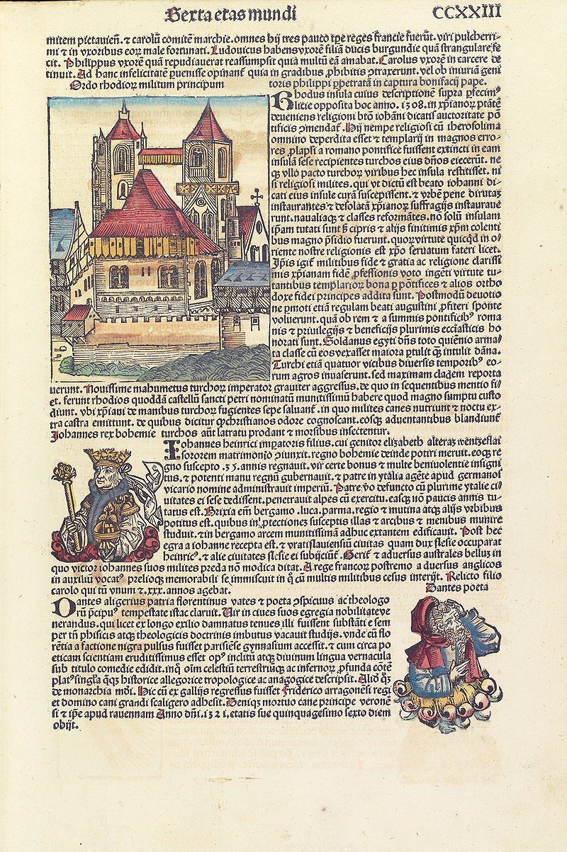
A page of the "Nuremberg Chronicle", first printed in 1493. This biblical paraphrase and history text was one of the first books to integrate illustrations and texts and has long been regarded as one of the most desirable incunables. The most recent copy at auction fetched nearly $120,000 in November 2017.
Even with their market value clearly defined, it’s difficult to quantify exactly how valuable early printed books are. The Printing Revolution spread knowledge and learning across Europe faster than any previous technology. The transmission of texts in the early decades of moveable type printing tells us about religious practice, cultural trends, scientific understanding, education, and literary sensibilities. The practicalities of printing (type, paper, ink, etc.) are essential for learning about 15th century economics, trade, division of labor, and technological progress. So, even if Gutenberg didn’t invent the printing press in 1450, we can thank him for one of the most important innovations of the last 2,000 years.
Our upcoming Spring Books and Works on Paper Sale will feature a couple of items from these early printing categories. Take a look below be sure to follow our website for updates about this exciting auction.

Caracciolus, Robertus, Sermones de laudibus sanctorum, (Augsburg, Anton Sorg 23 Feb 1490);
Incunable collection of sermons in praise of the saints by the famed Franciscan preacher (1425-1495).

This text incorporates two sizes of gothic type and red Lombardic initials added in manuscript at the opening of each sermon.

Since incunables did not have title pages as we know them today, we most often find their printers and publication dates on the final text page. This closing paragraph is called an "explicit" and typically names the author, printer, city of publication, and date of printing.

Bible (Latin): Biblia cum pleno apparatu summariorum concordantiarum, (Paris, Thielmann Kerver and Jean Petit 1504); This important post-incunable Vulgate Bible edited by Adrian Gemeau and Alberto Castellano incorporates fine metalcut initials.

Like incunabula, many of these early 16th C books made use of different sizes of gothic type to differentiate text and headings.

Post-incunabula also do not have regular title pages, so they often incorporated explicits in the same way as 15th C books.


B52club làm mình chú ý đến cách một trò chơi có chủ đề riêng được giới thiệu để người mới dễ hình dung nội dung. Mình quan tâm đến Night Out thuộc Nổ hũ, đặc biệt là cách chủ đề đêm sôi động được thể hiện qua phần mô tả và hình minh họa. Khi tìm hiểu, mình thường nhìn vào vị trí tên trò chơi trước rồi mới xem các thông tin hướng dẫn đi kèm. Điều mình muốn đánh giá là cách những nội dung cơ bản được sắp xếp theo trình tự. Theo mình, việc trình bày có sự phân cấp rõ ràng giúp người xem dễ xác định những phần cần tìm hiểu khi lần đầu tiếp…
Jun88mx com khiến mình quan tâm đến cách những thông tin giải đấu được giới thiệu khi một chuyên mục bao gồm nhiều môn khác nhau. Trong Thể thao, mình tìm hiểu bóng đá qua những giải như La Liga và Serie A. Sau đó, mình chuyển sang quần vợt để xem phần giới thiệu Grand Slam. Mình thường chú ý đến cách tên giải đấu được đặt trong từng đoạn và sự liên kết với nội dung về môn thể thao tương ứng. Những phần giải thích giúp mình nhận biết phạm vi thông tin đang được đề cập. Theo đánh giá cá nhân, cách tổ chức theo từng môn giúp bài viết tổng quan có trình tự và dễ…
xổ số v79 làm mình chú ý đến cách những thành phần có thể thao tác được thể hiện trong một khu vực riêng. Khi mở phần đăng nhập, mình quan sát vị trí trường tài khoản, mật khẩu và hướng dẫn xác minh được giới thiệu. Sau đó, mình chuyển sang Xổ số để tìm hiểu kết quả miền Nam. Mình thường chú ý đến cách hai khu vực sử dụng những thành phần trình bày khác nhau. Phần tài khoản khiến mình quan tâm đến thứ tự các trường thông tin, còn nội dung kết quả làm mình chú ý đến cách phân chia từng mục. Với mình, bố cục phù hợp với mục đích giúp mỗi khu vực…
23win gợi cho mình sự tò mò về cách các lựa chọn có đặc điểm riêng được nhận diện thông qua những chi tiết trực quan. Khi tìm hiểu Casino, mình chú ý đến cách Baccarat được giới thiệu trong sảnh và vị trí hình ảnh đại diện. Mình thường quan sát tên trò chơi trước khi xem phần mô tả và những lựa chọn nằm cạnh. Sau đó, mình chuyển sang điện thoại để tìm hiểu cách các khối nội dung được điều chỉnh. Kích thước chữ và khoảng cách giữa hình ảnh là những chi tiết mình quan tâm. Với mình, sự cân đối trong cách trình bày giúp người xem dễ nhận biết từng lựa chọn khi không…
acb8 app gợi cho mình sự tò mò về cách những khu vực được nhận diện trên các kích thước màn hình khác nhau. Mình chọn Nổ hũ trên máy tính, quan sát vị trí các phần giới thiệu trong tổng thể trang. Sau đó, mình sử dụng điện thoại để tìm hiểu Bắn cá và chú ý đến thứ tự nội dung xuất hiện theo chiều dọc. Khi thay đổi thiết bị, mình thường dựa vào tên danh mục để xác định phần muốn xem. Mình cũng quan tâm đến cách hình ảnh và chữ được sắp xếp trong không gian nhỏ. Theo mình, những điểm nhận diện dễ ghi nhớ sẽ giúp quá trình chuyển thiết bị có sự…